There are three components involved in operating a good transit service: (1) design, (2) implementation, and (3) communication. That third component is often undervalued; in order to make the service useful you have to communicate how it is useful. The destination sign is an important part of this communication. It conveys crucial information -- " ## TO (place) VIA (street)" -- and should do so very efficiently so that waiting passengers can quickly decide whether to board that vehicle. Whenever possible I suggest limiting the information to two lines with only the most critical information and keeping the route number on both screens. Sometimes you can fit two lines on one screen, as is common in Philadelphia and San Francisco, two cities with a good grid system. An honorable mention goes to Boston for their generally excellent job of this despite operating hundreds of bus routes that couldn't possibly run in long straight lines.
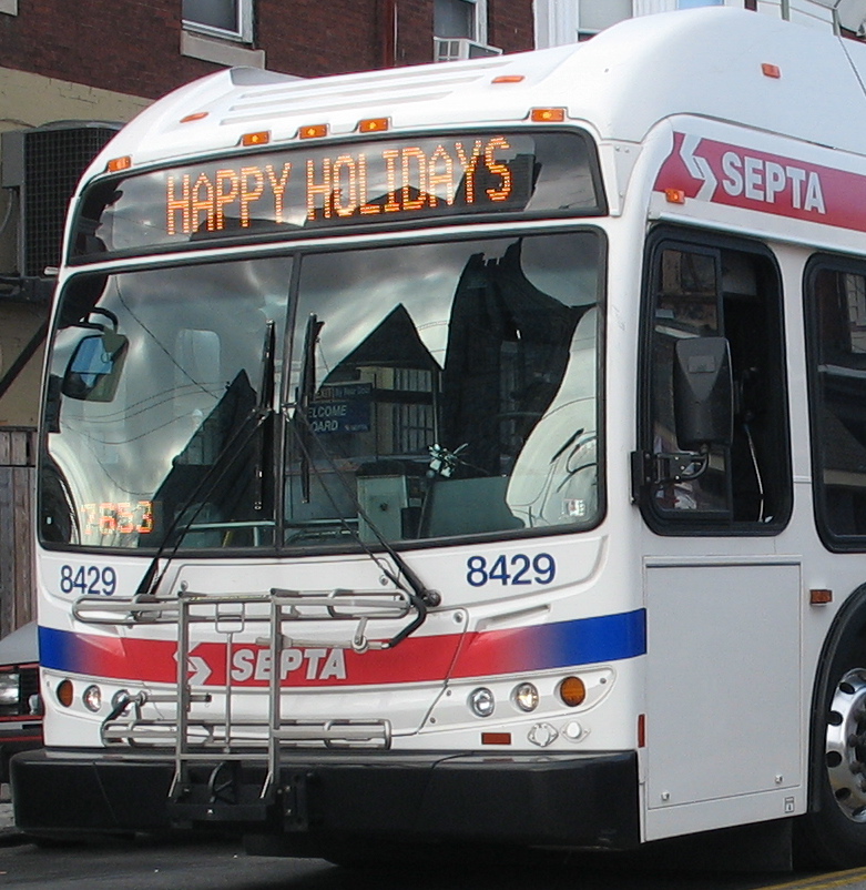
Adding extra information can complicate vehicle identification as it distracts from the most critical information. Just because the sign is capable of having five screens doesn't mean it should. Save that second or third screen for things like "snow route" or some other important "service alert", or better yet, make a color-coded cardboard sign to stick in the lower curbside corner of the front window if you need to display more info. But please, for the love of buses ... the destination sign is for route descriptions only! Not this:
Does that line tell you if this is your bus?
Not to pick on SEPTA as it's far from the only one. And whoever programmed this useless information was probably trying to be all nice and cheery, but ... stop it!

